To find how far one cylindrical sheet has travelled after a given time, we take
the velocity and multiply it by the time. We can visualize this by considering
a blood vessel that has blood flowing through it.
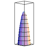
 Imagine that we place a dark
dye across the full width of the tube and then watch how it advances with
the fluid. Recall that laminar flow means that each molecule of the dye will
travel in a straight line down the blood vessel parallel to the center of the
tube. The shape which the dye will create is called a paraboloid. The graphic
that you see represents this shape in three ways.
The first is the surface visualized in three dimensions.
The second is called a contour plot (like a
contour map from geography) and it represents looking directly into the blood vessel. The curves which you see
(all of which are actually circles) show the points in the tube where the dye
has reached the same distance, with the curves closest to the center show
the greatest distance.
The third plot shows a slice up the middle of the
blood vessel, and this shape is a parabola.
Imagine that we place a dark
dye across the full width of the tube and then watch how it advances with
the fluid. Recall that laminar flow means that each molecule of the dye will
travel in a straight line down the blood vessel parallel to the center of the
tube. The shape which the dye will create is called a paraboloid. The graphic
that you see represents this shape in three ways.
The first is the surface visualized in three dimensions.
The second is called a contour plot (like a
contour map from geography) and it represents looking directly into the blood vessel. The curves which you see
(all of which are actually circles) show the points in the tube where the dye
has reached the same distance, with the curves closest to the center show
the greatest distance.
The third plot shows a slice up the middle of the
blood vessel, and this shape is a parabola.
In future sections of this lesson, we will only consider graphs of the parabolic
section.
 However, you can visualize the other two graphs in a simple way. To
get the surface in three dimensions, imagine that you spin the parabola around
the central line of symmetry.
If you leave dye at every point where the parabola
touches, you get the surface. To get the contour plot, imagine that every
half-millimeter you draw a curve connecting all of the points that are that distance.
Then take the image and look straight into it. That is the contour plot.
However, you can visualize the other two graphs in a simple way. To
get the surface in three dimensions, imagine that you spin the parabola around
the central line of symmetry.
If you leave dye at every point where the parabola
touches, you get the surface. To get the contour plot, imagine that every
half-millimeter you draw a curve connecting all of the points that are that distance.
Then take the image and look straight into it. That is the contour plot.